


Create Pomodoro Clock in JavaScript Tutorial | freeCodeCamp
September 09, 2019
12 min
Check out my Github for my free-to-read JavaScript Ebook that covers all the new features from ES6 to 2021. If you want find a great place for interactive tutorials, i recommend Educative where you can find my JavaScript course
This website contains affiliate links.
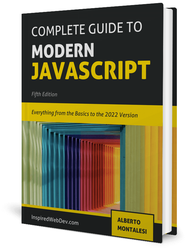
If you want to learn more about JavaScript, check out my book, available for purchase on Leanpub
In this tutorial you will learn how to create a simple HTML Login form like the one below. The design was taken from ColorLib, I simply recreated it from scratch.

We will only use HTML and CSS, no Bootstrap, no JavaScript.
Before we start writing the markup for our form, let’s import a couple of things: - fontawesome - Roboto, our google font Go ahead and paste this code inside the head tag of your index.html file.
<link
  rel="stylesheet"
  href="https://use.fontawesome.com/releases/v5.3.1/css/all.css"
  integrity="sha384-mzrmE5qonljUremFsqc01SB46JvROS7bZs3IO2EmfFsd15uHvIt+Y8vEf7N7fWAU"
  crossorigin="anonymous"
/>
<link
  href="https://fonts.googleapis.com/css?family=Roboto:300,400"
  rel="stylesheet"
/>

Now we can move on to writing our markup. We will first write all the HTML and then start styling it with CSS. The structure is fairly simple: - form_wrapper is our main contaner that we will position in the middle of the page - form_left will be the container for the image - form_right will be the container for our input tags - input_container holds a i containing a font-awesome icon and an input tag
<body>
  <div id="form_wrapper">
    <div id="form_left">
      <img src="icon.png" alt="computer icon" />
    </div>
    <div id="form_right">
      <h1>Member Login</h1>
      <div class="input_container">
        <i class="fas fa-envelope"></i>
        <input
          placeholder="Email"
          type="email"
          name="Email"
          id="field_email"
          class="input_field"
        />
      </div>
      <div class="input_container">
        <i class="fas fa-lock"></i>
        <input
          placeholder="Password"
          type="password"
          name="Password"
          id="field_password"
          class="input_field"
        />
      </div>
      <input
        type="submit"
        value="Login"
        id="input_submit"
        class="input_field"
      />
      <span>Forgot <a href="#"> Username / Password ?</a></span>
      <span id="create_account">
        <a href="#">Create your account ➡ </a>
      </span>
    </div>
  </div>
</body>
testNow it’s the fun part: styling with CSS. To achieve the expected result we will use flexbox and grid layouts alongside with CSS variables to store our colors. Storing values inside CSS variables will make changing colors very easy, have a look at this code:
:root {
  --body_gradient_left: #7200d0;
  --body_gradient_right: #c800c1;
  --form_bg: #ffffff;
  --input_bg: #e5e5e5;
  --input_hover: #eaeaea;
  --submit_bg: #1fcc44;
  --submit_hover: #40e263;
  --icon_color: #6b6b6b;
}
Good, now we will apply some default styling to override the browser default:
* {
  padding: 0;
  margin: 0;
  box-sizing: border-box;
}
The next step is to start styling the body and the form_wrapper Read the comments to better understand what we are doing here.
body {
  /* make the body full height*/
  height: 100vh;
  /* set our custom font */
  font-family: 'Roboto', sans-serif;
  /* create a linear gradient*/
  background-thumbnail: linear-gradient(
    to right,
    var(--body_gradient_left),
    var(--body_gradient_right)
  );
  display: flex;
}

#form_wrapper {
  width: 1000px;
  height: 700px;
  /* this will help us center it*/
  margin: auto;
  background-color: var(--form_bg);
  border-radius: 50px;
  /* make it a grid container*/
  display: grid;
  /* with two columns of same width*/
  grid-template-columns: 1fr 1fr;
  /* with a small gap in between them*/
  grid-gap: 5vw;
  /* add some padding around */
  padding: 5vh 15px;
}
On the left side we simply want to display an image centered.
#form_left {
  /* center the image */
  display: flex;
  justify-content: center;
  align-items: center;
}

#form_left img {
  width: 350px;
  height: 350px;
}
Now let’s move to styling the form_right container
#form_right {
  display: grid;
  /* single column layout */
  grid-template-columns: 1fr;
  /* have some gap in between elements*/
  grid-gap: 20px;
  padding: 10% 5%;
}
And this is the style for the input tags:
.input_container {
  background-color: var(--input_bg);
  /* vertically align icon and text inside the div*/
  display: flex;
  align-items: center;
  padding-left: 20px;
}

.input_container:hover {
  background-color: var(--input_hover);
}

.input_container,
#input_submit {
  height: 60px;
  /* make the borders more round */
  border-radius: 30px;
  width: 100%;
}

.input_field {
  /* customize the input tag with lighter font and some padding*/
  color: var(--icon_color);
  background-color: inherit;
  width: 90%;
  border: none;
  font-size: 1.3rem;
  font-weight: 400;
  padding-left: 30px;
}

.input_field:hover,
.input_field:focus {
  /* remove the outline */
  outline: none;
}

#input_submit {
  /* submit button has a different color and different padding */
  background-color: var(--submit_bg);
  padding-left: 0;
  font-weight: bold;
  color: white;
  text-transform: uppercase;
}

#input_submit:hover {
  background-color: var(--submit_hover);
  /* simple color transition on hover */
  transition: background-color, 1s;
  cursor: pointer;
}
Now let’s finish by styling our h1 and our span and a tags
h1,
span {
  text-align: center;
}

/* shift it a bit lower */
#create_account {
  display: block;
  position: relative;
  top: 30px;
}

a {
  /* remove default underline */
  text-decoration: none;
  color: var(--submit_bg);
  font-weight: bold;
}

a:hover {
  color: var(--submit_hover);
}

i {
  color: var(--icon_color);
}
Perfect. You now have a good-looking, simple HTML form. Let’s add a few more line of CSS to make sure that it will look nice even on smaller screens:
/* make it responsive */
@media screen and (max-width: 768px) {
  /* make the layout  a single column and add some margin to the wrapper */
  #form_wrapper {
    grid-template-columns: 1fr;
    margin-left: 10px;
    margin-right: 10px;
  }
  /* on small screen we don't display the image */
  #form_left {
    display: none;
  }
}
If you like this short tutorial, please leave a comment and share it with your friends. Let me know what else would you like me to cover in a future tutorial.